poweredby.tokyo Redesign
Client Monopo
Assignment Web Magazine
Role Art Director, UX, UI
Date 2017
The brief
The design agency Monopo asked me to redesign their cultural platform Poweredby.Tokyo. The client had identified that the usability of the current website structure could improve. They wanted to keep the black theme while introducing a simple editorial user experience, that can expand logically.
My approach
Introducing a modular structure, with contextual navigation, In a user-centered and mobile-first design.
The sprints
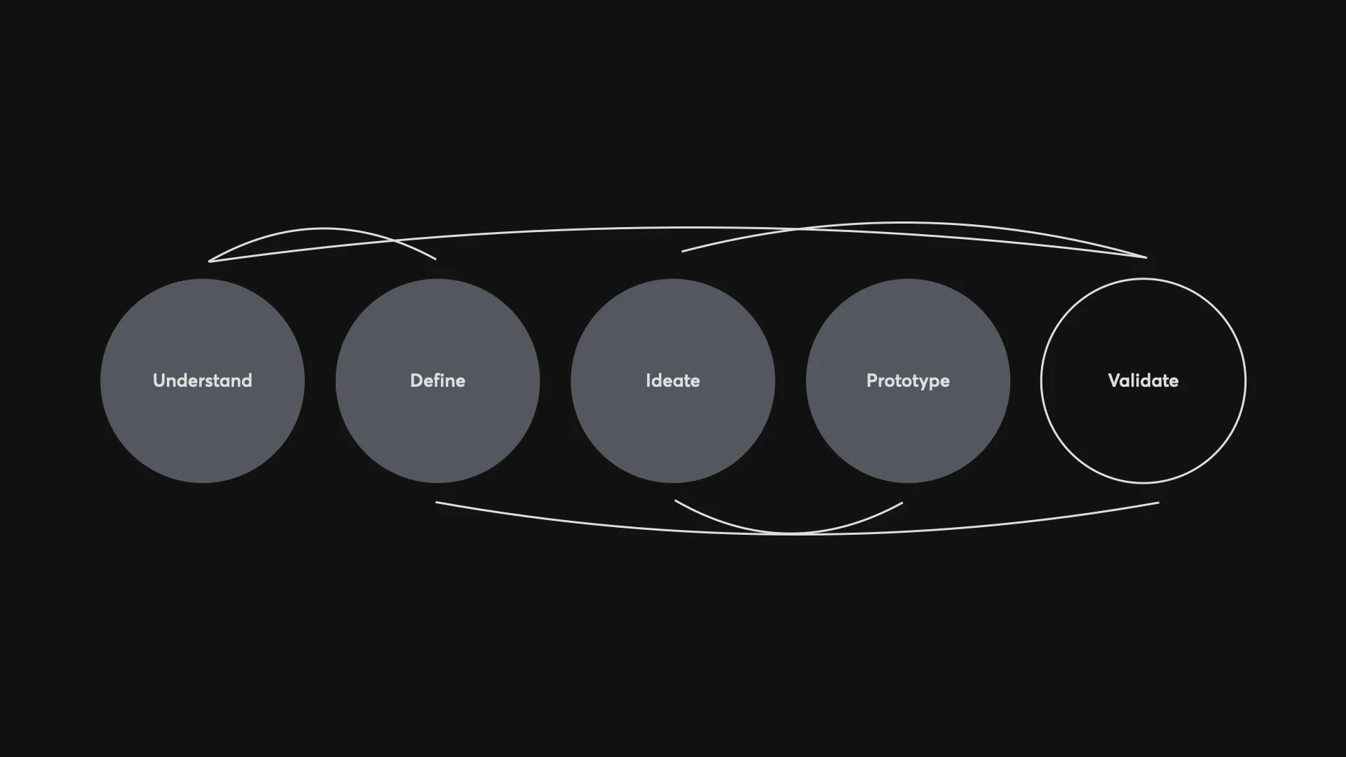
To keep aligned with the client I offered a transparent process with daily catchup testing, and sign-off. I followed a non-linear agile workflow, that allowed the ability to test and pivot while prototyping.
Play video below. 👇🏻
Content is King
Content is king was the ultimate focus for this user-centered design approach.
High level UX
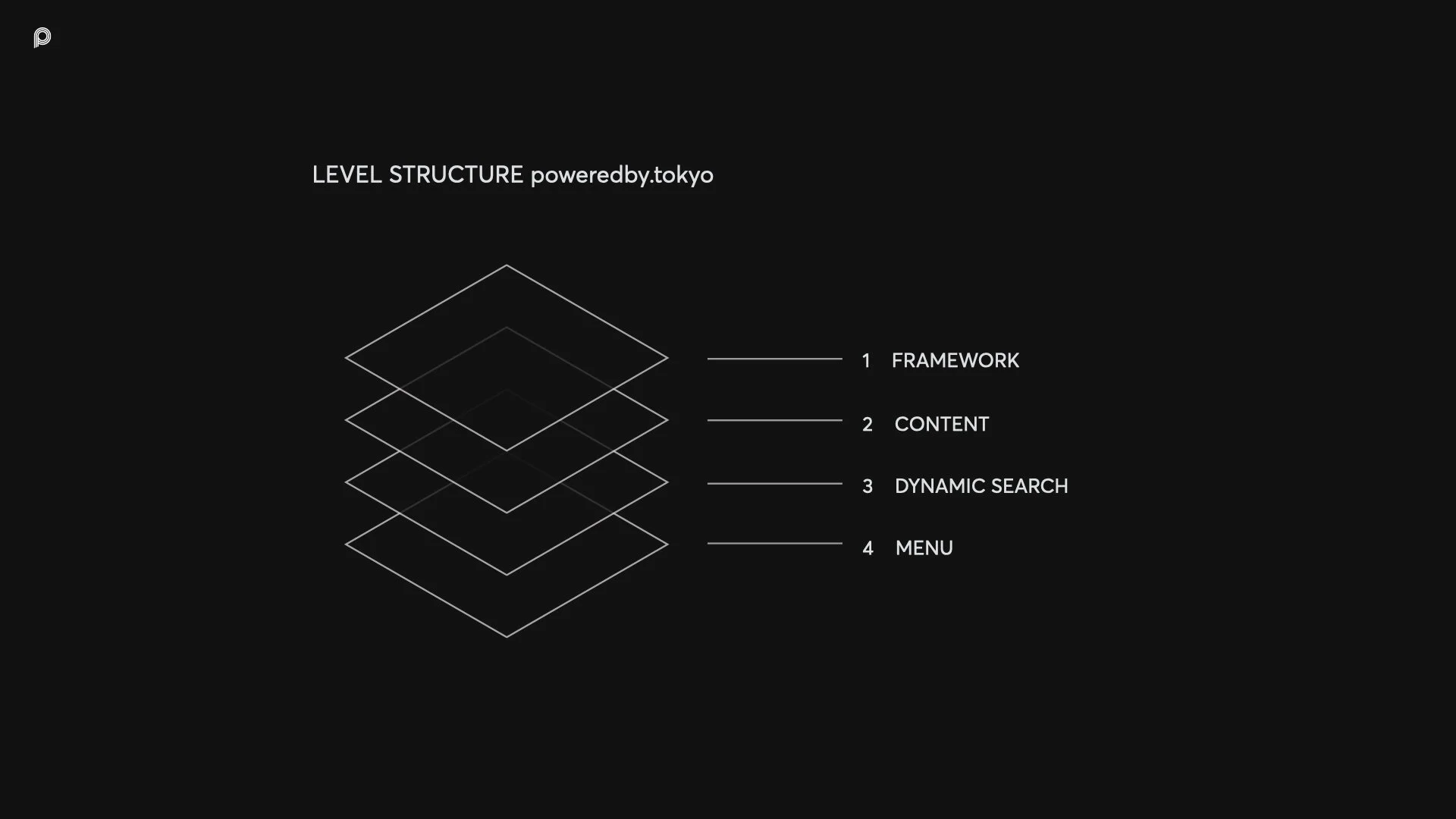
The architecture is responsive and adaptive while based on a 4 level structure.
Framework
Content
Dynamic search
Menu
The design
The visual design language is based on black to reduce distraction. The bold emotional images get fully attention for engagement and impact. The UI elements are minimal and consistent to keep the user orientated.
Prototypes
In order to measure how well the design solved the problem, I believe the best way is to build prototype. It’s that moment when the interactions are tangible.
Play video below. 👇🏻
Flowchart
To map out a broad overview of the website structure and features I created this flowchart and printed it out as a large poster on the wall.
Result
I delivered the concept, UX design, visual design, flowchart, and prototypes ahead of deadline without applying overtime. Due to different circumstance out of my scope the design has not yet been fully implemented.
Client Monopo
Role Art Director, UX, UI
Date 2017


